SAP Sales Cloud
Daily Catch-Up

Overview

Sales Representatives were losing 60%–70% of their time to non-selling tasks: navigating tools, triaging priorities, and recovering missed follow-ups. Daily Catch-Up solves this with a focused three-step flow that surfaces what matters most: upcoming activities, items missed the day before, and high-priority deals and leads at risk of falling through the cracks. The outcome is more time selling, deeper CRM engagement, and a measurable shift toward the customer-facing work that actually drives revenue.

Year 2024
Role
User Research & Testing
UX Strategy
Content Design
Interaction Design
Team
Product: Abhiram Naidu Bandaru
Development: Samiulla Hunasimarad, Fatma Mokhtar, Ashish Rawat, Rashmi R
SAP Sales Cloud Daily Catch-Up — app screens

What Prompted this Design Intervention?

Sales Reps spend up to 72% of their time on non-selling tasks, yet their CRM, the tool best positioned to help them prioritize and reduce that burden, goes underused.

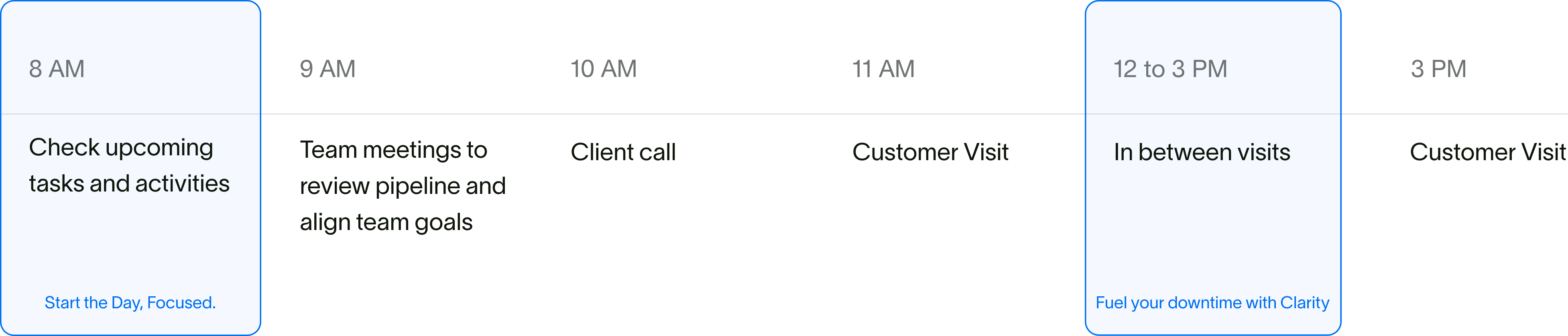
From the initial user research, we learned that Sales Representatives often struggle to prioritize. Activities and high-priority tasks come up throughout the day, and these signals are scattered across emails, chats, notifications, and different channels.

There have been efforts to help, e.g. AI summaries and ML insights, but they ended up adding to the noise and contributed to notification overload. Reps end up feeling overwhelmed and unsure what was actually relevant.

In fact, in the exploratory interviews conducted, only 1 out of the 6 interviewed Sales Reps mentioned they use the CRM in some capacity for planning.

Current State

So many signals, so little clarity.

Why this Matters

Less time for admin and more time for active-selling (customer-facing activities) are time well-spent.

This begs the question,
why aren't Sales Reps using the CRM more, especially when it comes to planning and prioritizing their day-to-day?

1 
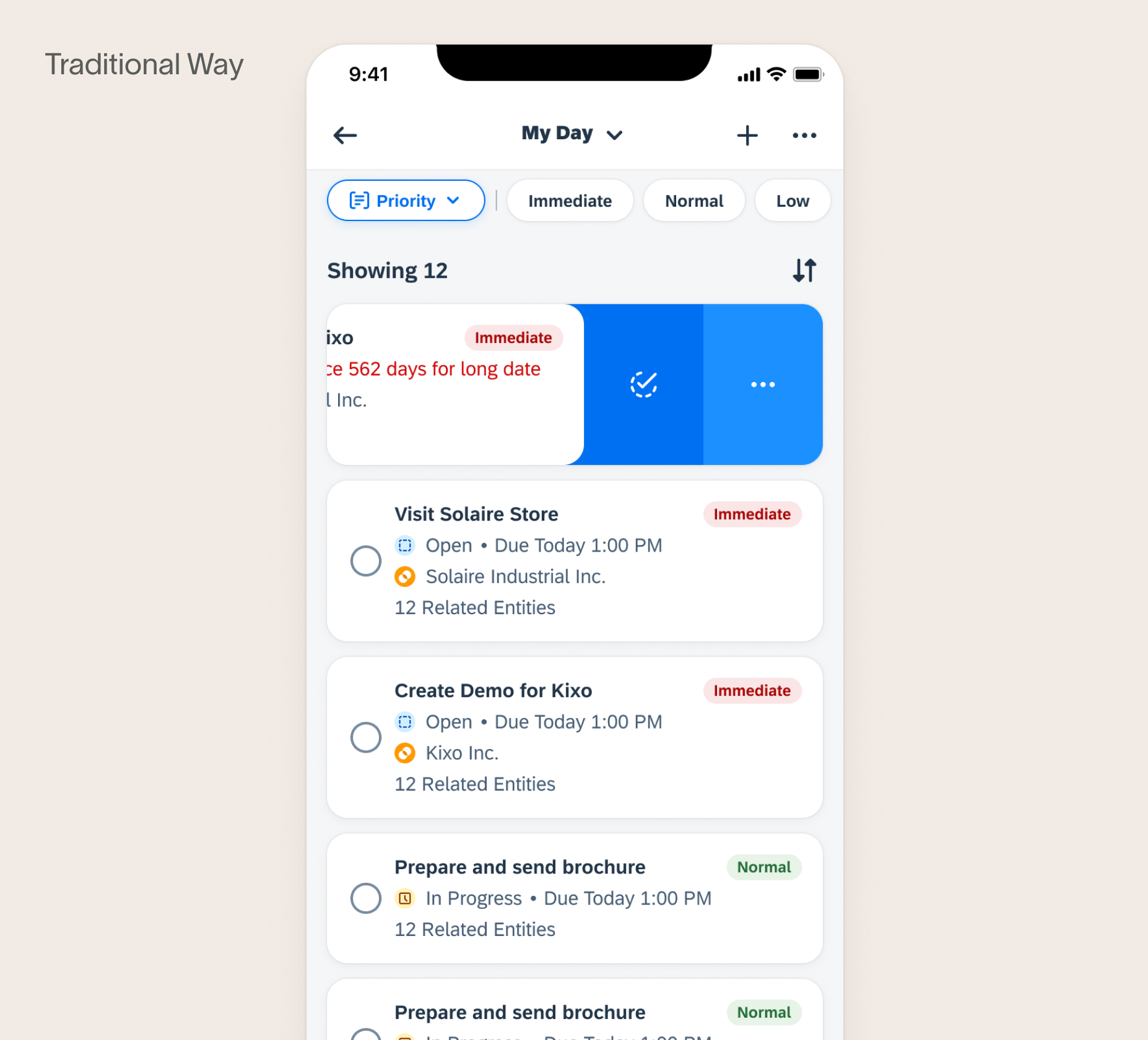
Unintuitive Interface

Many CRMs are feature-packed with numerous functionality, the complexity on a mobile screen contributes to challenges to simply update a task.

2 Lack of Immediate Value

Most CRM doesn't always provide actionable insights or reminders, making it seem like extra work with no pay-off.

3 Disjointed Workflows

CRMs don't sync seamlessly with tools like email or calendars, forcing reps to toggle between platforms, creating friction.

4 Misalignment with Goals

CRMs often prioritize activity tracking and reporting over helping reps hit their quotas or close deals, making the system feel misaligned with their primary objectives.

I haven't found a solution that works for me, so I've kind of reverted back to using emails each time."

Sales Rep, 44, Canada

"

However, using email to track priorities creates other issues...

Email is not time-efficient and more issues arise as a result of using email to keep track of their priorities. Tools like Outlook are not designed for task management. They usually present things in a chronological order rather than a priority-driven manner, so it still requires Reps to spend a relative amount of time and cognitive effort to actively look for items they need to follow-up on. From how the items are displayed, it's also difficult to identify the ones that need their attention the most.

Right now I'm using MS for information when I'm heading to a meeting, then I have to look and think about where to find that info."

Sales Rep, 28, UK

"

Key Insights

Sales Reps end up missing customer visits and necessary follow-ups — the most important part of a Sales Rep's role.

1 Priorities are scattered across multiple tools and platforms
2 Things could be more easily missed
3 Duplicated effort upon reporting & documentation
4 Missing important insights that the CRM could've offered them to progress a deal

Design Goal

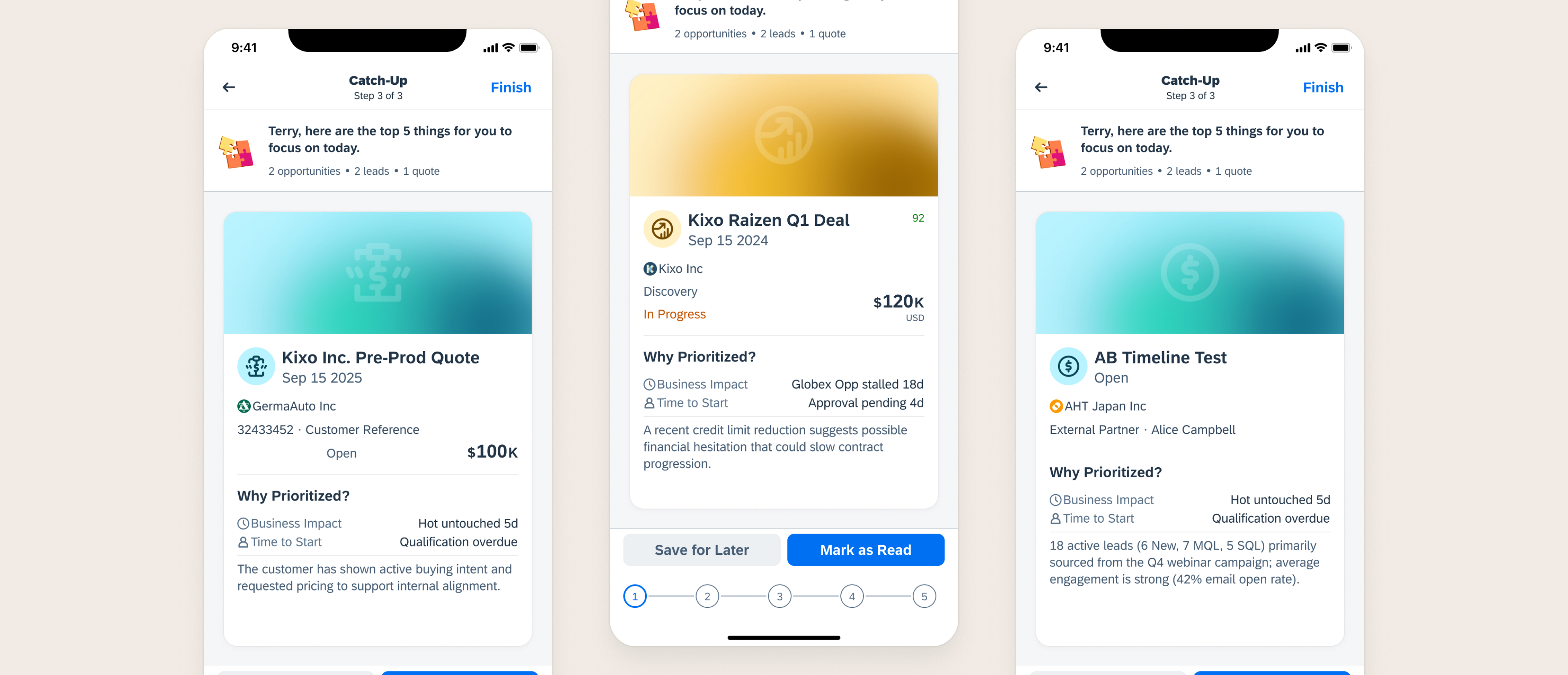
How might we turn scattered signals into a clear daily priority list so Sales Reps can focus on selling?

Design Principles

1One place, one truth.

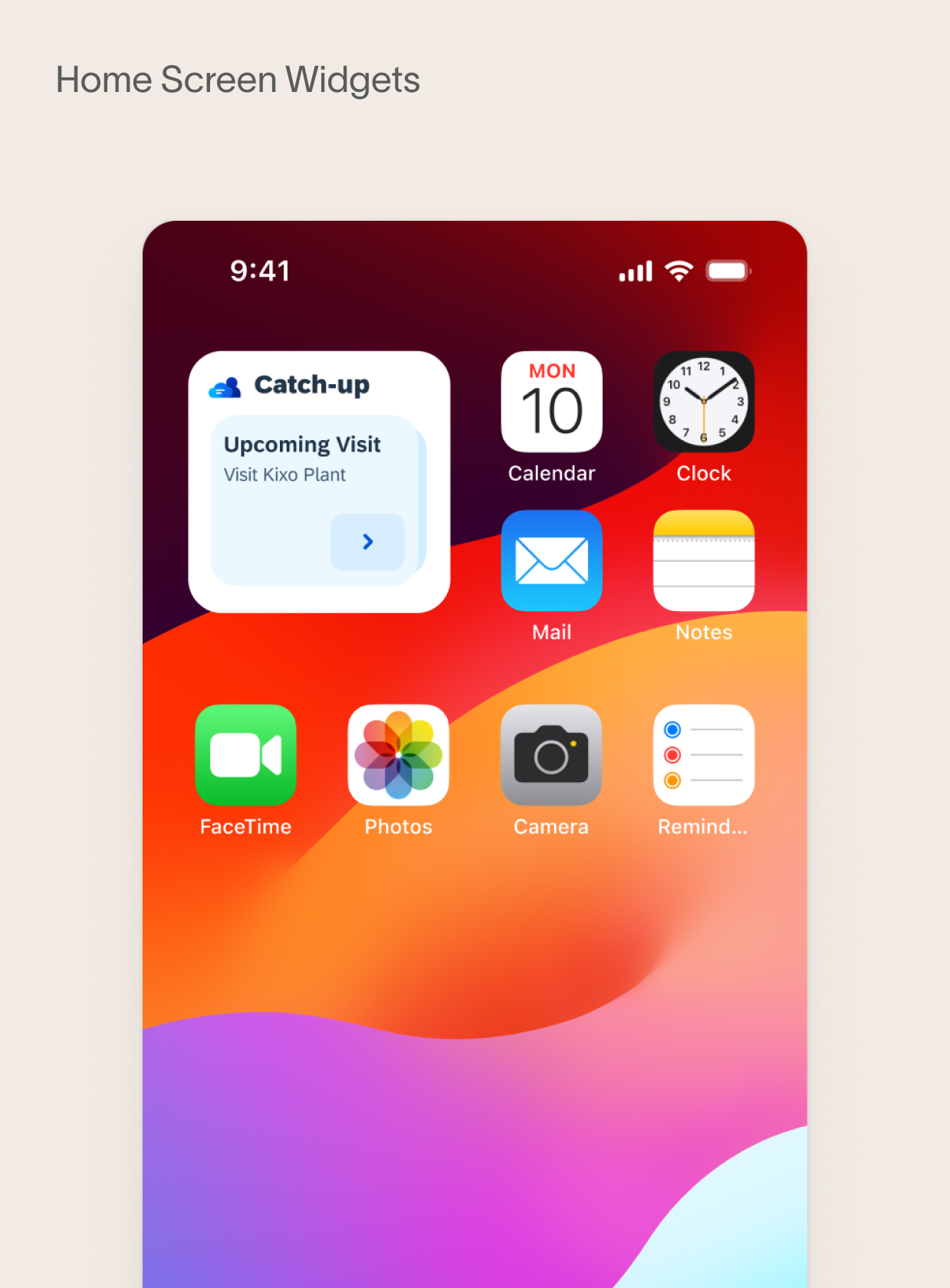
Signals live everywhere, the rep's attention shouldn't have to.

2If everything is a priority, nothing is.

Cap it at 5. Make every day feel achievable.

3Always present, never in the way.

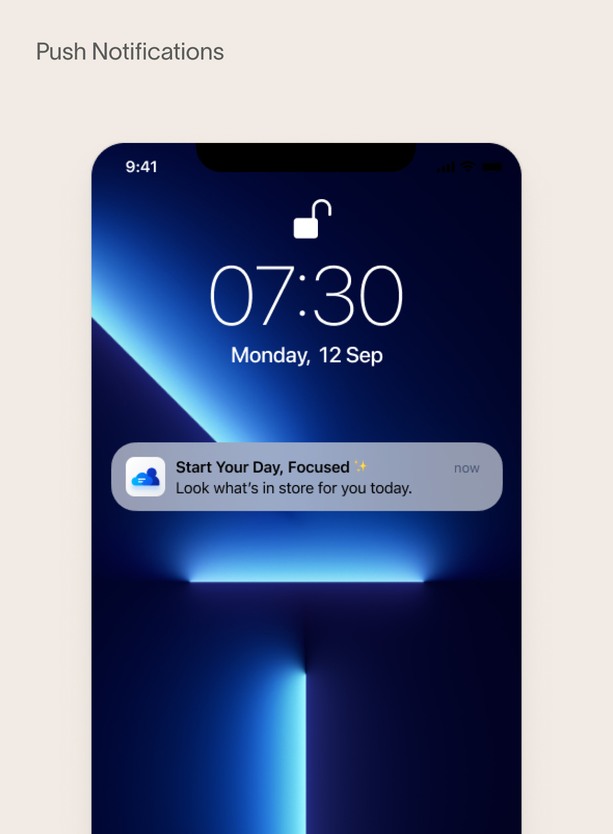
The information should surface at the right time, in the right context, through the right channel.

4Design for the rep who's already running late.

Speed and confidence aren't nice-to-haves. They're a must.
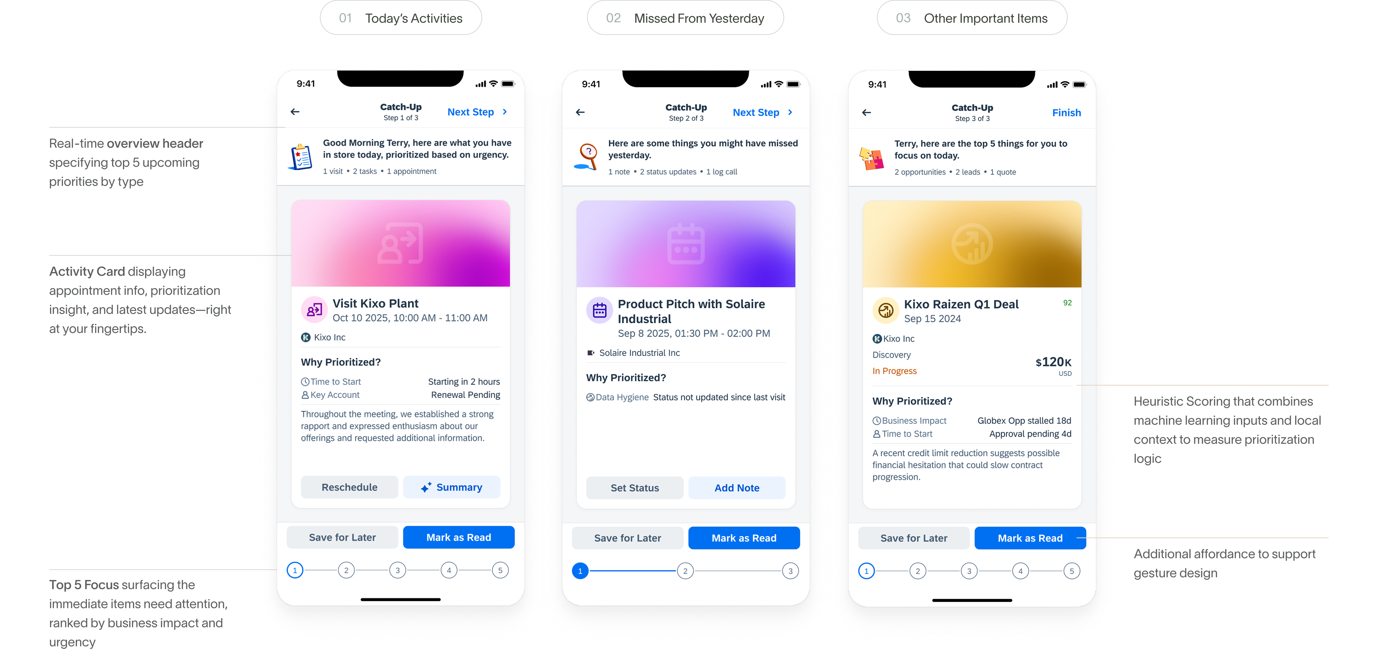
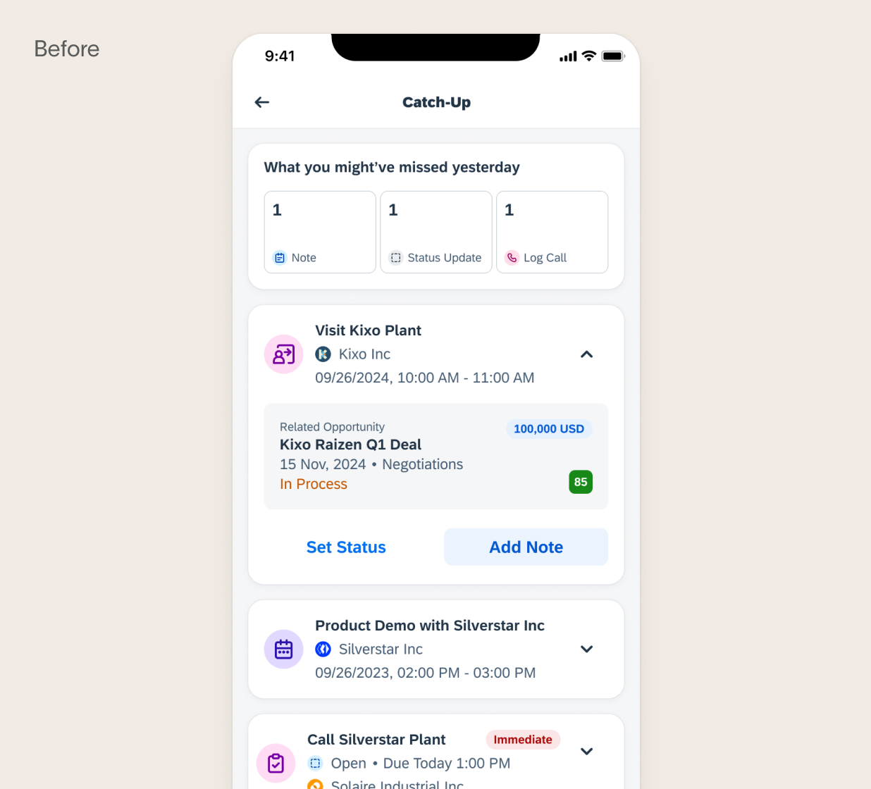
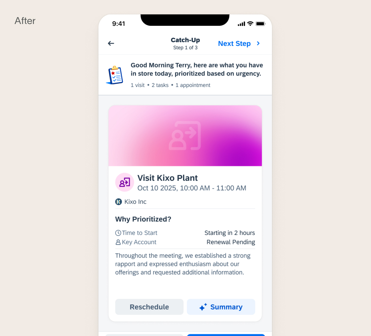
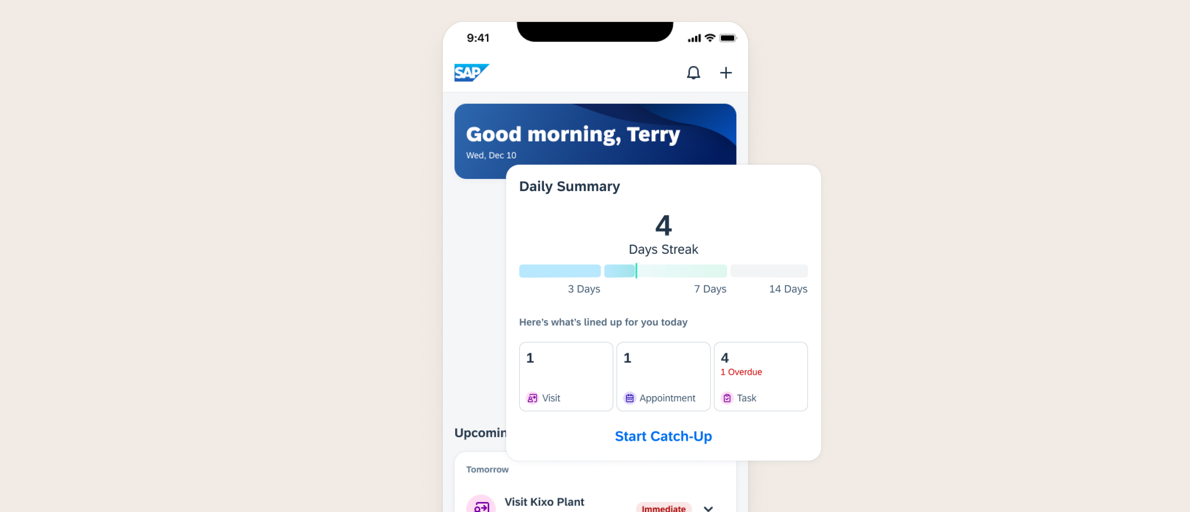
Design Proposal

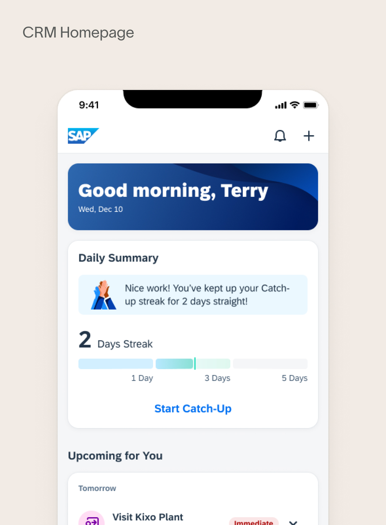
A focused daily view that tells Sales Reps exactly what to do and when.

By surfacing the right priorities and quick actions daily, the design eliminates the guesswork from a Rep's day: driving a 50% reduction in admin time, fewer missed deals, and higher CRM engagement, so reps spend less time figuring out what to do and more time selling.

Steps Showcase – Today's Activities, Missed From Yesterday, Other Important Items

Design Decision #1

Moved away from traditional, cluttered lists to a modern, card-based layout to reduce cognitive load.

When Daily Catch-Up was first designed, it was adopting the traditional Sales Cloud list layout. I thought the traditional layout provides a sense of familiarity to the end user. However, as I think more deeply about the design goal of this flow, I decided to move forward with a card-based layout so that Reps can focus on what matters most without the distraction of competing items.

Before – traditional list layout After – card layout

Each card has a clear front and back. A simple tap reveals additional details only when the user needs them, keeping the primary view clean and focussed.

Card layout detail

Design Decision #2

Tactile Design: leveraging gestures and haptics that is natural to a mobile experience.

Up until this point, Sales Cloud mobile app has been consistently using embedded swipe actions to mark items as complete. However, that is hidden and a learned behaviour. As I moved forward to using full-page card layout, I decided to take full advantage of mobile gestures to enhance usability of the card.

Swiping through cards feels natural, quick, and thumb-friendly, with almost no learning curve. User can use directional swipes to instantly mark tasks as complete or save them for later, without extra taps or navigation.

Smooth animations and subtle haptics also add a touch of delight and give the flow a light, game-like quality. The overall experience feels faster, more intuitive, and more enjoyable on a small mobile screen.

Traditional way – swipe gesture New way – card gesture

Design Decision #3

One Consolidated, Guided Flow.

Previously, I also explored surfacing prioritized items directly on the Sales Cloud homepage. However, the list can quickly becomes long and requires excessive scrolling.

As I define the principle "one place, one truth", I decided to bring everything into one consolidated, guided flow. The idea is that Reps can simply launch this flow and prepare themselves for the day in one sitting.

Before – traditional homepage list After – consolidated guided flow

Design Decision #4

Keeping the number of "Top Focus" under 5: if everything is a priority, nothing is.

Every day, Reps can also find the high priority items as part of step 3 of the Catch-Up flow. This step surfaces items that often fall through the cracks because they do not appear in the upcoming activity list.

That can include: high-value deals, hot leads, quote nearing expiry. Each of these items are ranked with the same logic on business impact and urgency.

The list is also capped to five items based on this logic, as the objective is to have an attainable and realistic set that Sales Reps can manage in one day.

Top 5 focus items

Design Decision #5

Discoverability is a non-negotiable: multiple entry points to meet users where they are.

One of the biggest questions from the beginning of this project was: how do we get users to use this flow when they barely use the CRM?

Echoing the principle "always present, never in the way", I designed several different entry points that provide value to the end user in ways that naturally fit their workflow. This makes the feature more intuitive, encourages frequent use, and ultimately reinforces habit formation.

Push Notifications Home Screen Widgets CRM Homepage

Time-based push notification: an external trigger that eliminates the need to open the CRM to discover Catch-Up. This drives engagement from the start of the day.

Home Screen Widget: allow users to view key information directly on their phone screen without opening the CRM.

Dedicated Catch-Up Card: for those who are already on the CRM, the card serves as another launch point, ensuring seamless access.

Design Decision #6

The work should be enjoyable! Not another thing to check off the list.

Habit formation is at the heart of this flow. I remembered reading Hooked by Nir Eyal — his central argument is that truly transformative products don't just solve a problem once, they create the conditions for users to return on their own.

That idea stuck with me throughout this design. It raised a key question: how might we create moments of feedback that genuinely invite reps to keep going, not out of obligation, but out of momentum?

The answer led to an animated daily streak system. Streaks tap into a simple but powerful truth: progress is motivating, and visible progress even more so. Alongside this, a message banner adds positive reinforcement to tie the habit loop together with a human touch.

The goal isn't gamification for its own sake. It's to make showing up feel rewarding.

Daily summary with gamification

Grounding Designs in Real User's Feedback

Catch-up started as a morning prep, turned out it can be seamlessly integrated throughout the day.

I entered the design process with the impression that this feature would only help Sales Reps start their day with greater focus.

When I tested the design with end users, they noted that its value extended beyond the morning — it also proved useful throughout the day, especially during downtime between customer visits.

"The problem it does solve is figuring out what to do during the downtime in between meetings.

Sales Rep, 47, US

"
Use cases across the day – Start the Day Focused, Fuel your downtime with Clarity